Tuesday, 11 May 2010
Monday, 10 May 2010
Sunday, 9 May 2010

Movie Poster
Below is the movie poster for our trailer. I decided to use a shot I took at the location where we filmed out film as the background as I feel it gives a mysterious feel to the poster and by keeping it vague I felt that it might get people interested in the movie because it is left intentionally vague.
Apart from the background image, the rest of the poster is pretty similar to most poster released for real media products. At the top of the page there is a small tag line which helps with the spooky feel of the poster and also helps guide the viewer in the right direction concerning what genre they think the film will be.
At the bottom of the page, there is the title off the film in a deep, red font which connoted danger and death and again helps let the viewer know what genre of film it is. Just above the main title the two main actors names are placed, if this was a real film placing the actors names here would be done to use star theory, in which many people would be willing to go and see a film based solely on what actors are in it or who directed it. Below the title there is the billing block which gives different information about the film companies, actor, producers etc that are involved in making the film.
Tuesday, 20 April 2010
Organisation: Storyboards
Before we began filming our trailer, we used storyboard to roughly plan out what is going to happen in it. Each shot was decided with a shot type, sounds involved, and a small picture to give and idea to what is happening. The storyboards can be seen below.


Monday, 19 April 2010
Organisation: Props
Our trailer only contained two props; they were a fake gun, a lighter. The fake gun was used to make the army man look more realistic as that is what you would expect someone who was in the army to have. The lighter was used in a short scene at the start of the trailer to show how badly the army man was tortured.
Sunday, 18 April 2010


Organisation: Costumes
The main two costumes that we used in our trailer were the army costume for myself and the black costume that was used for the torturer. The army costume consisted of camouflage pants with suspenders and navy tank top. I feel that this, coupled with the fake gun prop, gave a good representation of an army man and it make it instantly recognisable to the audience to what his job was/used to be.

As for the torturer, his costume consisted simply of a black trench coat with black cloth placed over his head to hide his face. Again, with the use of the fake gun, I felt that it was obvious what the scenes with the torturer are about, even though there is no obvious mention (in the form of a voice-over or otherwise) that it he is getting torturer.

The other actors in the film simply wore average, everyday clothes. We decided to do this to make the character seem like normal people in an extraordinary situation, which makes it easier for the audience to relate with them. Also, thinking about production/organisation, it was simply easier to get our actors to choose their own clothes

Tuesday, 13 April 2010
Organisation: Actors
For our actors, we decided to just use to people in our groups. We chose this because we felt it would be easier to get together at a time that suited us all and as there was not much actual "acting" in our film and the scenes lengths are very short, the believability of our footage would not be a problem. The actors that are featured in out trailers are:
Josh Hogan: Josh played one of the teenager who was getting terrorised by the psychopath.

Oliver Moore: (Myself): I played the army man/psychopathy

Tom McKee: Tom played the other teenager in the film, he gets attacked by the psychopath.

Georgia Turner: Georgia played the part of the torturer at the start of the trailer.

Josh Hogan: Josh played one of the teenager who was getting terrorised by the psychopath.

Oliver Moore: (Myself): I played the army man/psychopathy


Georgia Turner: Georgia played the part of the torturer at the start of the trailer.

Wednesday, 17 March 2010
Organisation: Venues
The main venue that we used in our trailer was a former manor house called Lydiate Hall that now remains in ruins, which is located just past St Catherine's Chapel in Lydiate. Lydiate Hall dates back to 1500-1550. I have placed several photographs of that location below


We decided to choose this location because just before the sun goes down, the low lighting gives the place an eerie feel that we felt would work well with the genre of our film. The building itself is destroyed so much that it remains only in different pieces which are mainly just tall walls, which made it easy to fit a variety of interesting shots into our trailer.


We decided to choose this location because just before the sun goes down, the low lighting gives the place an eerie feel that we felt would work well with the genre of our film. The building itself is destroyed so much that it remains only in different pieces which are mainly just tall walls, which made it easy to fit a variety of interesting shots into our trailer.
Friday, 26 February 2010
Movie Magazine Front Cover Analysis #2: Transformers
Labels:
Transformers
0
comments
The February 2007 edition of Empire magazine (issue 212) focused an a Transformers preview and also contained information about Pirate Of The Caribbean 3, The Simpson's Movie, Grindhouse, Bourne 3, Blood Diamond, Harry Potter 5 and Spiderman 3. The magazine also contained interviews with Will Smith and Beyonce.

The masthead at the top of the image is a the same masthead that is used on every issue of Empire, this is an example of brand loyalty because if people were to start buying the magazine regularly then they will start to notice the masthead and automatically make it their first choice of magazine. The masthead is made up of just the word 'EMPIRE' in large, bold capital letters and on this edition is in the colour red which matched in with the colour scheme on the rest of the page. The date and price are place between the dip in the M of Empire in the masthead.
Also at the top of the page their is a small strip of text which relates to the background image and the words 'World Exclusive!" are shown which gives connotations of never seen before information that the reader will only find in this magazine. The use of the words 'World Exclusive' and are done purposefully as they are buzz words that are likely to attract the viewer attention in the hope that they will want to find out more and buy the magazine.
The colour scheme of the page is strictly red white and blue which matches with the background image that is made up of medium shot of a Transformer. The red, white and blue are very patriotic colour of the American flag which relate to the movies story of the Transformers protecting America.
Placed over the background image is the main anchorage text which relates to the background picture and lets the reader know that their is a preview of the new Transformers movie inside. The anchorage, however, feels very messy. The small text above and below the man 'Transformers' title has been rotated slightly which makes the whole middle section seem unsymmetrical and odd. The text below which says '2007' and 'preview' are in different font styles and in italics which, again, makes the anchorage as a whole look like a big mess of different text styles that do not fit together very well.
To the bottom of the main anchorage text there there is a small 'Also staring' section which lists more of the contents of the magazine in the same red/white colour scheme.
There is a small puff placed in in the upper left of the front cover. It used the words 'Optimus Prime Arrives' and this relates to the main image on the page which is of the character Optimum Prime. This use of Star Theory attracts the reader attention as the name might be a character that they already know and may be interested in.
At the very bottom of the page there is a bar code on the left hand side which is usual for most movie magazines and there is a small banner that runs along the bottom with names like Will Smith and Beyonce which uses star theory by using celebrity names to attract the readers attention.
I feel that this along with the main and sub anchorage text means that there is a large amount of informtion on the page and the page and the way that it is arranged it makes the whole page look very messy and makes the magazine seem amateurish compared to a more stylised magazine like TotalFilm (see Shutter Island magazine analysis) which has about the same amount of information on but seems much cleaner and generally more professional. I will take this into account when designing my magazine front cover.
Poster Analysis #3: Hard Candy
Labels:
David Slade,
Ellen Page,
Hard Candy,
Patrick Wilson
0
comments
Hard Candy is an independent thriller film which was directed by David Slade and stars Patrick Wilson and Ellen Page. The film focuses on a confrontation between a sexual predator and a 14-year-old girl he attempts to seduce.

The poster for the film is made up of several different elements. The main image of the poster in the middle and shows a young girl in a red hooded top. This is clearly a throw back to little red riding hood, and connotes innocence of the small child which then highly contrasts by the dark, grungy design of the bear trap which she is standing on which conveys that the girl is likely to be in some sort of danger. This lets the viewer know that the film is much darker than might be first apparent from the title.
The background of the image is a very simple textured gradient which helps to draw the viewer’s eyes to the centre image. The colours of the gradient background start off at the top with an off-white/yellowish colour which has the girl in the foreground, which convey the child’s innocence but it fades down into a much duller grey colour with the bear trap in the foreground.
The use of colour along with the striking image of the girl standing on the bear trap helps grab the viewers attention by using shock tactics which will, in turn, make them more interested into finding out what the film is about. The bear traps helps to show the viewer that the film is likely to be in the thriller/horror genre.
The other elements of the poster are the movie title and the quote from an ‘expert witness’. The movie title is done in a very simple, grey, all capitals font which isn’t very distracting and makes this poster a more visual poster rather than a verbal poster, with a lot more emphasis on the image rather than the text of the poster. There is also one quote from an expert witness at the very top of the poster which is also not very distracting at all, keeping the main image as the main focal point for the poster.
Overall I believe this is a good poster as the use of shock tactics with the main image of the poster help interest the viewer in the film and hopefully makes them want to find out more about it/go and see it. I believe it communicates with the audience successfully as it simply and effective portrays the themes of child vulnerability with the use of the image and gets the point across without having to throw too much information at the viewer.
Trailer Analysis #2: Inception
Inception is an upcoming American science fiction film written, produced and directed by Christopher Nolan. The film stars Leonardo DiCaprio, along with Ken Watanabe, Joseph Gordon-Levitt, Marion Cotillard, Ellen Page, Tom Hardy, Cillian Murphy,Tom Berenger and Michael Caine. The film follows an agent named Dom Cobb (Leonardo DiCaprio) who can drug up tycoons and enter their minds to find out their secrets and strategies. Cobb then uses the secrets to sell to the highest competing bidder. However, the mind is a volatile place, where places can rearrange and people can have power much stronger than in reality, and the complications of the mind can create dreamscapes that can end in mere seconds, trapping the agents with them.
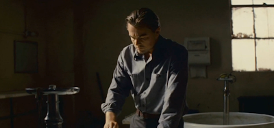
As with Shutter Island, it is apparent from the first viewing of this trailer which genre it fits into. The dramatic music which slowly builds up to a climax at the end paired with the slow scenes to start and then short scenes to end show that this film is a thriller. The slow scenes at the start, with the voice-over, help to explain the basic plot of the film, but it it not explained thoroughly, presumably to give the viewer a taste of what the film is like with the hope that they will want to see more. The film is officially categorised as a sci-fi thriller and the sci-fi elements show through in several strange scenes in which physics is seemingly defied, such as the scene where the ground starts to lift up and flip over like a wave:

And when the water in the glass moves:

The characters in the film are also briefly shown. Leonardo DiCaprio is the main actor in the film (again, as with Shutter Island, he is used to draw in potential viewers who would be happy to see a film just because he is in it) and is shown to to be the protagonist who is trying to steal an 'idea'.


DiCapro's name is clearly shown on one of the title screen. The director Christopher Nolan, who is popular because of his success with The Dark Night, is also mentioned. As is the fact that he directed The Dark Night. This is another case of star theory where people will be draw to see the film because he is the director and they have enjoyed his past work.

The music used in the trailer is a dramatic score in which booming sound effect happen when the scenes change. The score really helps to show the genre of the film and sets the mood well. The trailer ends with the stylised title screen which is then followed by a billing block:


Sunday, 21 February 2010
Poster Analysis #2: Requiem For A Dream
Requiem For A Dream is 2005 film directed by Darren Aronofsky. The film is based on a novel Hubert Selby, Jr and was adapted into a screenplay by Selby and Aronofsky. It was produced by Eric Watson, Palmer West and Scott Vogel and the main actors in the film are Ellen Burstyn, Jared Leto, Jennifer Connelly, Marlon Wayans and Christopher McDonald.
The film itself exposes four individuals and shows the effects of their addiction to heroin, cocaine and diet pills (speed). It takes place in Brooklyn where drugs are easily obtainable, which in turn keep each main character in their own cycle of dependence. The protagonist, Harry Goldfarb, is your typical heroin junky with an ambitious plan of getting 'getting a pound of pure' with help from his two friends; this cocaine crazed girlfriend Marion and his long time friend Tyrone. Meanwhile, his widowed mother is obsessed with the glamor of television and eventually find her way to dietitian who pushes her into the cycle of drug induced enslavement herself.

The poster for Requiem For A Dream is shown to the left. The poster is made up of two images split up by a horizontal bar. The top image is a close up of an eye which is blood shot with a dilated pupil. This shows drug use and referes to the technique of quick cuts of the drug taking process that is used a lot in the movie to show when drugs are being used. To the top of the image is four actors names which is used for star theory in the hope that a viewer of the poster may have prior knowledge of the actors work and they may become interested in seeing this movie. Above the image the is a small, thin black banner containing the text "From the director of pie". This use of other films can also interest viewers in the same way star theory can, if the viewer has seen and liked the film pie then they might consider seeing this film because it is by the same director.
The horizontal bar in the middle of the page contains the film title and another mention of the director of the film, this time with his name used. This required viewers of the poster to have prior knowledge of Darren Aronofsky's work for it to be successful but if they do, they may be more interested in seeing the film because of him.
The image below is from one of the dream sequences in the movie and trailer. The image is perfectly symetrical with pier being centred in the frame and the woman in the red dress being placed in the middle of the pier. This goes against the rule of thirds, but the image remains interesting to the eye because of it. To the bottom of the bottom image there is the billing block. It contains different information about the film from the writers, producers and actors to the companies that produced the film.
Compared to the Shutter Island poster, this poster is much more simplified and less stylised but the use of the two images, especially the close-up of the eye, keep the poster interesting to the eye the the several uses of star theory help to draw viewers of the poster to see the movie.

The film itself exposes four individuals and shows the effects of their addiction to heroin, cocaine and diet pills (speed). It takes place in Brooklyn where drugs are easily obtainable, which in turn keep each main character in their own cycle of dependence. The protagonist, Harry Goldfarb, is your typical heroin junky with an ambitious plan of getting 'getting a pound of pure' with help from his two friends; this cocaine crazed girlfriend Marion and his long time friend Tyrone. Meanwhile, his widowed mother is obsessed with the glamor of television and eventually find her way to dietitian who pushes her into the cycle of drug induced enslavement herself.
The poster for Requiem For A Dream is shown to the left. The poster is made up of two images split up by a horizontal bar. The top image is a close up of an eye which is blood shot with a dilated pupil. This shows drug use and referes to the technique of quick cuts of the drug taking process that is used a lot in the movie to show when drugs are being used. To the top of the image is four actors names which is used for star theory in the hope that a viewer of the poster may have prior knowledge of the actors work and they may become interested in seeing this movie. Above the image the is a small, thin black banner containing the text "From the director of pie". This use of other films can also interest viewers in the same way star theory can, if the viewer has seen and liked the film pie then they might consider seeing this film because it is by the same director.
The horizontal bar in the middle of the page contains the film title and another mention of the director of the film, this time with his name used. This required viewers of the poster to have prior knowledge of Darren Aronofsky's work for it to be successful but if they do, they may be more interested in seeing the film because of him.
The image below is from one of the dream sequences in the movie and trailer. The image is perfectly symetrical with pier being centred in the frame and the woman in the red dress being placed in the middle of the pier. This goes against the rule of thirds, but the image remains interesting to the eye because of it. To the bottom of the bottom image there is the billing block. It contains different information about the film from the writers, producers and actors to the companies that produced the film.
Compared to the Shutter Island poster, this poster is much more simplified and less stylised but the use of the two images, especially the close-up of the eye, keep the poster interesting to the eye the the several uses of star theory help to draw viewers of the poster to see the movie.
Movie Magazine Front Cover Analysis #1: Shutter Island
Shutter Island is a 2010 film directed by Martin Scorsese and starring Leonardo DiCaprio. Production started in March 2008. Shutter Island was originally slated to be released on October 2, 2009, but Paramount pushed the release date to February 19, 2010.
The film is set in 1954 where two U.S. marshals investigate the disappearance of a patient from a hospital for the criminally insane on an island in Massachusetts. They run into trouble when they are deceived by the hospital's chief administrator, a hurricane hits, and an inmate riot traps them on the island.
Total film magazine is published by Future Publishing and is the UK's best-selling film magazine. It offers film and DVD new, reviews, and features. It was launched in 1997 and is published monthly.

The background of the cover is an image of mist surrounding an island with a lighthouse on. The image is tinted blue giving the cover a predominately blue background colour.
The cover conforms to most aspects of a regular movie magazine. It has a masthead containing the magazine title, which is used similarly to a logo (even though it just made up of text) as it is kept the same for each edition of the magazine and helps to define the house style of the magazine which makes each edition instantly recognisable the regular viewers. The masthead is very simple, but it is because of this (and the layout choice for the rest of the pages) the the magazine looks very professional and classy. To the right of the masthead the lighthouse of the background overlaps to give it a more dominate position on the page. The lighthouse has a bright yellow light which contrasts greatly against the rest of the colour on the page which could be used to catch the viewer eye but also could been seen as a beacon of hope in the film (as on the movie poster). The yellow on the lighthouse image also matches with the small picture in the top left of the page.
Below the masthead on the left is the text for the main article of the front cover, the Shutter Island article. DeCaprio's name is mentioned twice for star theory, it is done in the hope that reader will have prior knowledge of DeCaprio's work so may be interesting in his new film. Two different fonts are used for this puff. A bold, red font for the main title, 'Shutter Island'. The red of the font connotes horror, danger and possibly death, this helps to show the genre of the movie to the reader. The edges of the font are smudged to make the letters look like they are covered in blood, again helping to show the nature of the movie. The red font also contrasts the blue background fairly heavily which will help to catch the reader eye. The other font that is used is a plain white font which is used for the catchy headlines for the article. The use of the name 'Marty' is in relation to the director of the film Martin Scorsese and requires the reader to have prior knowledge of his work in order to be interested by the mention of his name.
The main image of the page is of the star of Shutter Island, Leonardo DeCaprio. The picture is tinted blue which matches with the background colour (which helps to assimilate the colours of the character to the colours of the background) and the other blue elements on the page. The image is a sinister character picture with his facial expression and his smart but untidy clothing helping to show this. The picture is clearly superimposed over the background which helps to give the image a strange angle which confused the viewers eyes slightly and makes the cover more interesting.
To the right of the main image there is another small puff which a picture and quote from the article on the film Avatar from inside the magazine. The red and blue colour scheme is kept to on this puff which keeps the look of the magazine consistent and professional. Buzzwords are used again here with the quote stating 'It's got everything'. This helps to get the reader interested in what is inside the magazine and may persuade them to buy it.
Above the masthead there is banner which relates to one of the articles that is in the magazine. The title of the banner also used buzzwords such as greatest, ever and top. There is a small picture to on the left hand side of the banner that is predominately yellow, this matches with the yellow of the light of the lighthouse to the right of the masthead and keeps the colour scheme consistent. This, along with the reds and blue I have already mentioned, show that the colour scheme for the front cover has been carefully considered and crafted artistically to look good to the eye. The red, white and blue colour scheme could also be seen as a hint that it is an American film, with those three colour being the colours of the American flag.
Wednesday, 10 February 2010
Trailer Analysis #1: Shutter Island
Shutter Island is a 2010 film directed by Martin Scorsese and starring Leonardo DiCaprio. Production started in March 2008. Shutter Island was originally slated to be released on October 2, 2009, but Paramount pushed the release date to February 19, 2010. The film is set in 1954 where two U.S. marshals investigate the disappearance of a patient from a hospital for the criminally insane on an island in Massachusetts. They run into trouble when they are deceived by the hospital's chief administrator, a hurricane hits, and an inmate riot traps them on the island.
The extended trailer for this film can be viewed on the video embedded below.
When I first watched the trailer it was clear straight away what the genre of the film was, a psychological thriller. The trailer starts by setting the scene with some extreme long shots to show where the film takes place. First with one of the island:

And then with one of the prison itself:

A sense of the story in the film is built up throughout with the detective arriving at a strange island at the start where he learns that one of the patients has gone missing, the missing patents has suggested that there is an extra patient on the island which they don't know about and then things start to get weird for the detective which vision of his wife on the island etc.

Several methods are used to lure potential viewers in to the theatre. One of these methods is star theory. Star theory is used in the trailer with Leonardo DiCaprio being the main actor used to draw people into the cinema.

Many people are fans of Leonardo DiCaprio as an actor and for women he could be seen as the sexual interest in the film, the use of a popular, good looking actor helps people to be persuaded to go and see the film. It becomes clear that this movie does not feature an ensemble casts and is a more intimate movie as DiCaprio is the only actor who's name is mentioned in the trailer.

The directors name, Martin Scorsese, is also shown toward the start of the trailer. This is another case of star theory being used and many people would be likely to go and see a film by Scorsese simply because he is the director.

The film is edited as would be expected for a film in this genre. The plot details are given using slightly longer scenes where the characters in the film can be see and hear saying lines from the film which when hear in succession help to detail the plot of the film. Then for dramatic effect, and especially as the trailer moves towards the climax at the end, shorts scenes with fasts cuts are used to imply that it is a fast paced, excited film. The short scenes often show clips of the film which may shock/scare.

The music in the trailer is a mix of dramatic score with lots of banging sound effects generally used when a quick cut is used. This helps to give that impression that the film is fast paced and the dramatic score gives a eerie feeling which lets the viewer know that it is a thriller film.
The trailer ends with the title screen which shows the movie title in a stylised way and is followed by the billing block, which gives information about the production companies, director and the actors in the film.


Poster Analysis #1: Shutter Island
Shutter Island is a 2010 film directed by Martin Scorsese and starring Leonardo DiCaprio. Production started in March 2008. Shutter Island was originally slated to be released on October 2, 2009, but Paramount pushed the release date to February 19, 2010. The film is set in 1954 where two U.S. marshals investigate the disappearance of a patient from a hospital for the criminally insane on an island in Massachusetts. They run into trouble when they are deceived by the hospital's chief administrator, a hurricane hits, and an inmate riot traps them on the island.

The top third shows the main character of the film, Leonardo DiCaprio. This is normal for film poster to use an image of the main character but in this case it is not used so much for star theory at this part of the poster (the star theory is used more at the bottom of the page, where the actors name is mentioned). I say this because it is a dark image with only part of his face visible, this means that some people who we're not fully aware of who he was wouldn't recognise who he is. The image is used more to show that the character is lonely and goes through his journey in the film on his own, there is no other characters/actors mentioned on the whole poster.
His facial expression tell us a lot about the movie. He has a furrowed brow with open eyes, which make it look like he is looking for something but is not sure what it might be. His eye is a bright blue which not only matches with the colour scheme of the poster, shows innocence in the character. He is also not looking at the camera which gives the sense that he is paranoid.
The character is holding a lit match, which provides the light which lights up his face. The match contrasts the rest of the poster and draws the eye immediately as yellow is one of the most eye catching colours (along with red in the main title). In terms of relevance to this film, it again echoes the theme that he is looking for something, presumable in a dimly lit place (presumable on the island, pictured below). The positioning of the match above the lighthouse on the image of the island seems like a deliberate decision, the light could be seen as a beacon of hope which stands out against the otherwise dreary background images.
The middle third of the poster contain the image of an island, this is fully relevant to the movie title and the viewer instantly presume that his is an image of 'Shutter Island'. The image itself is strange, it is purposefully cut up with lines which look like parts of the full image have been cut out and the remaining images have been pushed back together. This gives a physiological uneasiness to the image which makes the viewer think that all is not as it might seem on the island. The weather around the island is rough, there is a clearly an ongoing storm as the rain is visible in the light above the island, rough seas can be seen all around it and big waves are crashing up against it. The use of these techniques create a pathetic fallacy around the island, it makes it seem like it has human thought and knows it is a bad/scary place. There is also a glow around the island which looks like it is cause by the island blocking out a light source placed directly behind it. This gives the impressions that the island is divided/blocked off from the rest of the world by something.
This bad/scary image is enhances further by what is on the island. There are several buildings surrounded by a large wall with barbed wire on the top which gives one of three impressions; it was either built to keep something in, keep something out or both. It shows that the island is clearly not a hotel but the light that are on in the windows of the building show that some people are living on the island. This makes the viewer think about what is actually on the island and is a good technique to use on a movie poster as it give small clues about the plot of the film without giving away all the information at once, it makes the viewer want to go and find out more.
The bottom third of the poster shows more text based information about the film. At the top there is direct use of star theory with the directors name and the main actors name shown. This is done so that people who know these people might be aware of their other work so might become interested in the film. Just below their names is the movie title. It is larger than all the other text on the page so that is stands out better and is in a very vivid red font which is not only used to contrast the against the background images (as with the match) but it also connotes danger as it is can be directly linked with blood. The grunge effect around the text makes it look as if the text is bleeding into the water of the background image which again shows danger/death.
Overall the poster fits conventions of a horror/mystery film with the use of dark colours and desaturated images. The poster for Shutter Island can be split into three; the top third contains a character image, the middle third shows an image image of the island and the bottom third show the films title and the billing block.
The top third shows the main character of the film, Leonardo DiCaprio. This is normal for film poster to use an image of the main character but in this case it is not used so much for star theory at this part of the poster (the star theory is used more at the bottom of the page, where the actors name is mentioned). I say this because it is a dark image with only part of his face visible, this means that some people who we're not fully aware of who he was wouldn't recognise who he is. The image is used more to show that the character is lonely and goes through his journey in the film on his own, there is no other characters/actors mentioned on the whole poster.
His facial expression tell us a lot about the movie. He has a furrowed brow with open eyes, which make it look like he is looking for something but is not sure what it might be. His eye is a bright blue which not only matches with the colour scheme of the poster, shows innocence in the character. He is also not looking at the camera which gives the sense that he is paranoid.
The character is holding a lit match, which provides the light which lights up his face. The match contrasts the rest of the poster and draws the eye immediately as yellow is one of the most eye catching colours (along with red in the main title). In terms of relevance to this film, it again echoes the theme that he is looking for something, presumable in a dimly lit place (presumable on the island, pictured below). The positioning of the match above the lighthouse on the image of the island seems like a deliberate decision, the light could be seen as a beacon of hope which stands out against the otherwise dreary background images.
There is a very small three word tag-line which states "Someone is missing.", this confirms that the main character is looking for someone and also tells the reader that it is a person that he is looking for (as oppose to an object/place/etc).
The middle third of the poster contain the image of an island, this is fully relevant to the movie title and the viewer instantly presume that his is an image of 'Shutter Island'. The image itself is strange, it is purposefully cut up with lines which look like parts of the full image have been cut out and the remaining images have been pushed back together. This gives a physiological uneasiness to the image which makes the viewer think that all is not as it might seem on the island. The weather around the island is rough, there is a clearly an ongoing storm as the rain is visible in the light above the island, rough seas can be seen all around it and big waves are crashing up against it. The use of these techniques create a pathetic fallacy around the island, it makes it seem like it has human thought and knows it is a bad/scary place. There is also a glow around the island which looks like it is cause by the island blocking out a light source placed directly behind it. This gives the impressions that the island is divided/blocked off from the rest of the world by something.
This bad/scary image is enhances further by what is on the island. There are several buildings surrounded by a large wall with barbed wire on the top which gives one of three impressions; it was either built to keep something in, keep something out or both. It shows that the island is clearly not a hotel but the light that are on in the windows of the building show that some people are living on the island. This makes the viewer think about what is actually on the island and is a good technique to use on a movie poster as it give small clues about the plot of the film without giving away all the information at once, it makes the viewer want to go and find out more.
The bottom third of the poster shows more text based information about the film. At the top there is direct use of star theory with the directors name and the main actors name shown. This is done so that people who know these people might be aware of their other work so might become interested in the film. Just below their names is the movie title. It is larger than all the other text on the page so that is stands out better and is in a very vivid red font which is not only used to contrast the against the background images (as with the match) but it also connotes danger as it is can be directly linked with blood. The grunge effect around the text makes it look as if the text is bleeding into the water of the background image which again shows danger/death.
Below the poster title is the billing block. This gives more textual information about the film including the producers, who wrote the original novel, who wrote the screenplay, the website address and studio logos. All this information is written in a small part of the posters and towards to bottom to not distract too much from the main images. At the bottom, in the middle of the billing block is the release date of the film, this is done in the same font and colour as the movie title but smaller. This is again used to contrast the background to draw the viewers eye to the release date, which is one of the most important parts of the poster.
Movie Promotion Questionaire
To find out what my audience thought about different type of movie promotion, I created an online questionnaire which I can distribute through social networking sites to get a good range of peoples views. I will review the results of the questionnaire at a later date.
Tuesday, 19 January 2010
Welcome!
Hello and welcome to my blog!
My name is Oliver and I am a student at Deyes High School studying Media Studies. Over the next 6 months or so I will be updating this blog with my progress on my coursework and the related research. The aim of this blog is to clearly show my progress in a diary-like style to show the different stages of work done during my coursework. I hope as the posts go on, my personal development will become clear.
What is my brief?
My task for this coursework unit is to create a promotion package for a new film. It must contain a teaser trailer, a poster for the film and the front cover of a music magazine featuring the film.
In order to be successful in my tasks, I feel it is important to carry out both primary and secondary research so I can get a idea of who my target market is and how they feel towards film trailers and posters. By doing this I will be able to design my products with my target market in mind, so I can be more sure that they will like them and therefore be more likely to be interested in seeing the film it is advertising.
What are your intentions?
I intend to start with primary and secondary market research into film trailers, poster and film magazine front covers. I will try to figure out what people think makes a good trailer/poster/magazine cover so that I can plan my product in a way that I know will be successful. Once I have completed both my primary and secondary research, I will be able to analyse the data that I will have collected to see what the view of my target market are.
What are you intending to do first?
The first step that I plan to take is to start my primary research and create a questionnaire which can be complete easily online. The questionnaire will contain questions about the three areas of promotion that I need to find out about; movie trailers, posters and magazine covers. As I will be doing it online, the results from the questionnaire will be automatically to a spreadsheet which I can view as raw data or in graph form to make better sense of the information.
What are you going to do for your research?
As mentioned above, my primary research will involve creating a questionnaire with questions about the three different areas that I need to research. I will the collate the data an analyse the results to make guidelines for creating my products. As for my secondary research, to complete that I will analyse the magazine covers and articles of current music magazines so see how they have used different techniques to represent different things and to show different ideologies.
Subscribe to:
Comments (Atom)

